fbpx

Backgrounds

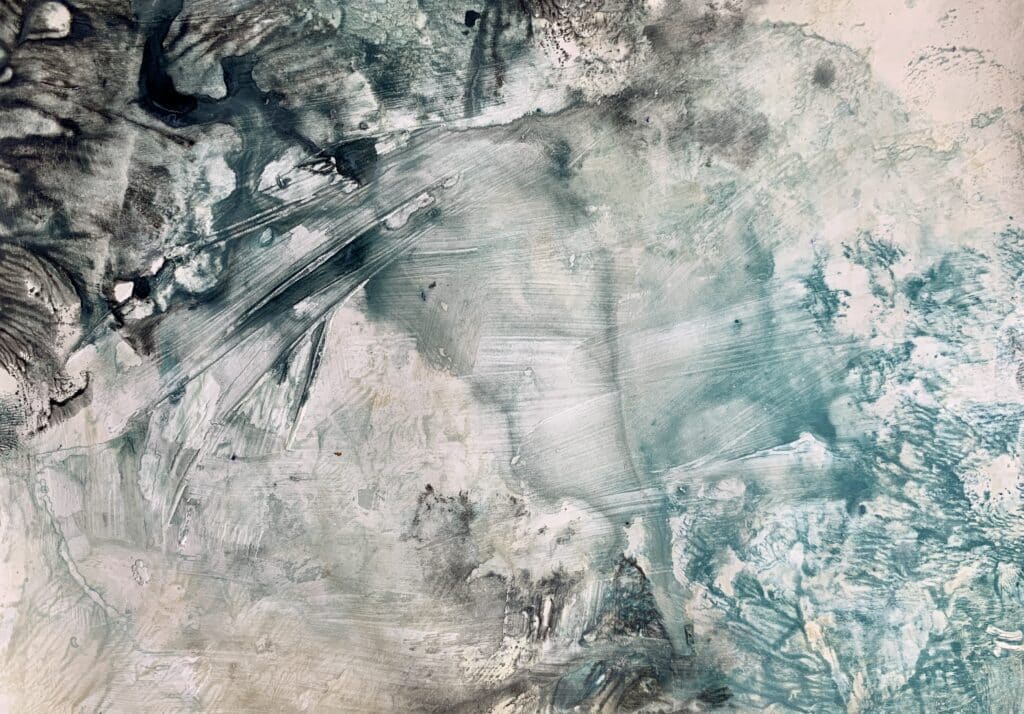
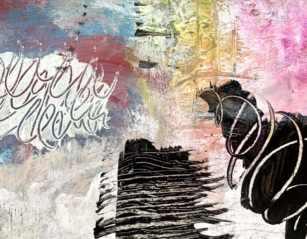
Transforming Backgrounds with Sgraffito: Adding Depth and Contrast through Mark-Making

Art is about transformation and exploration. Sometimes, what starts as a less-than-perfect background can evolve into a captivating piece. If you’re looking to revitalize a background or introduce striking contrasts, the sgraffito technique offers a fantastic solution. Whether you use your background as a painting surface or unique collage paper, this approach will enhance your work with depth and texture. Let’s dive into how sgraffito and mark-making can elevate your art.

Letting Go: Creating Organic, Textured Backgrounds with Gesso and Color

In art, there’s a certain freedom that comes with releasing control and allowing the process to unfold naturally. Today, I want to share a technique that’s all about embracing unpredictability and letting your materials take the lead. Using gesso and color variations, you’ll create a textured, organic background that emerges on its own, without the …

Letting Go: Creating Organic, Textured Backgrounds with Gesso and Color Read More »

Mark making with soft pastels – Creating Intentional Backgrounds

Creating art is more than just putting marks on paper—it’s about expressing your emotions, connecting with your inner self, and letting your intuition guide you. Today, I want to share a simple yet powerful process for creating a beautiful, emotionally resonant background using soft pastels, gesso, and a few intentional techniques. This background can serve …

Mark making with soft pastels – Creating Intentional Backgrounds Read More »

Art Journal Background 1

Reflect and Journal: Begin by taking a moment to think about the thought or feeling you want to express on this page. Spend a few minutes journaling about it—let your words flow freely. This will guide the visual elements you choose to include.

Stenciled Foundation: Place an A4 stencil on your journal page. Choose two acrylic colors that resonate with the theme or mood you want to convey. Apply the colors randomly with a brush, allowing them to blend naturally. Tip:Whether it’s calm blues, passionate reds, or earthy tones, let the colors be an extension of your emotion.

Thoughts & Intentions while doing backgrounds

Color Harmony: Choose colors intentionally. Consider the emotions associated with different hues. Warm tones (reds, oranges) evoke energy, while cool tones (blues, greens) create calmness. Texture Exploration: Experiment with various textures. Use stencils, bubble wrap, or crumpled paper to create interesting surfaces. Think about how each texture contributes to the overall feel. Layering Depth: Build …

Thoughts & Intentions while doing backgrounds Read More »