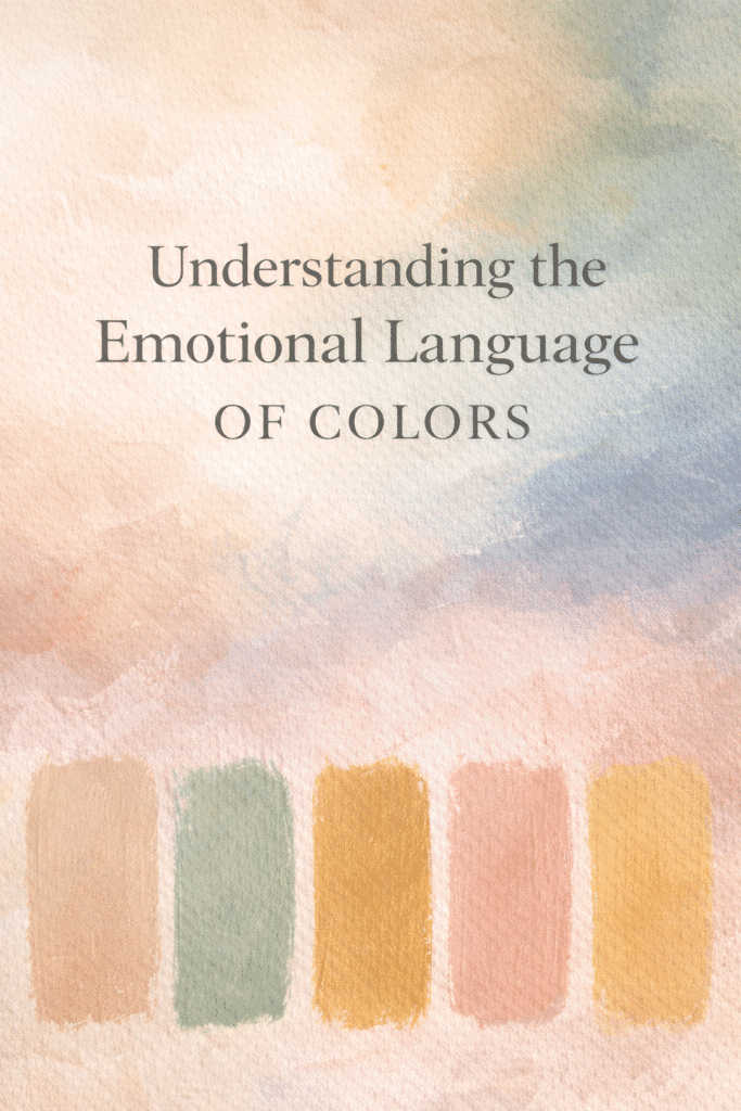
Colors hold immense emotional power. They have the ability to convey moods, evoke memories, and express feelings in ways that words cannot. For abstract paintings, this becomes even more important because color often speaks in place of recognizable forms.
By tapping into the subtle power of muted colors, we create an intuitive palette that evokes feelings and depth without overwhelming the senses. Let’s explore the meanings behind some muted, aesthetic colors and how we can use them more intuitively in our work.
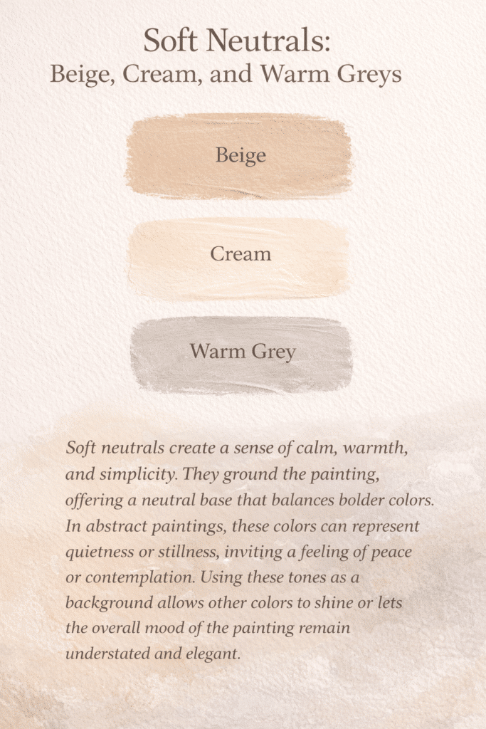
1. Soft Neutrals: Beige, Cream, and Warm Greys
- Soft neutrals create a sense of calm, warmth, and simplicity.
- They ground the painting, offering a neutral base that balances bolder colors.
- In abstract paintings, these colors can represent quietness or stillness, inviting a feeling of peace or contemplation.
- Using these tones as a background allows other colors to shine or lets the overall mood of the painting remain understated and elegant.
How to use intuitively: When we’re feeling the need for balance or grounding in our work, these colors are a good starting point. They can act as a canvas for more dynamic colors or serve as a refuge for the eye when there’s a lot of texture or movement in the painting. Trust your instinct to lean into these hues when you need softness or simplicity.
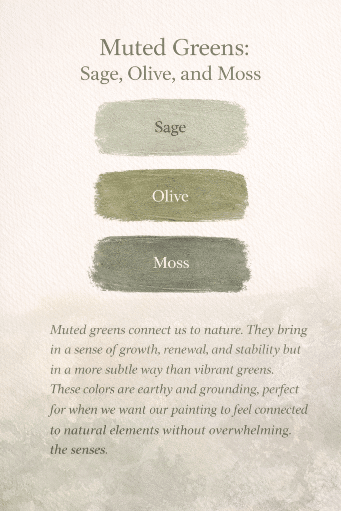
2. Muted Greens: Sage, Olive, Moss
Muted greens connect us to nature.
They bring in a sense of growth, renewal, and stability but in a more subtle way than vibrant greens. These colors are earthy and grounding, perfect for when we want our painting to feel connected to natural elements without overwhelming the senses.
How to use intuitively: Sage and olive tones work beautifully when we want to evoke tranquility or a quiet sense of renewal. If we feel drawn to nature or are working through themes of growth, muted greens can become our go-to. They allow for exploration without the loudness of more saturated greens.
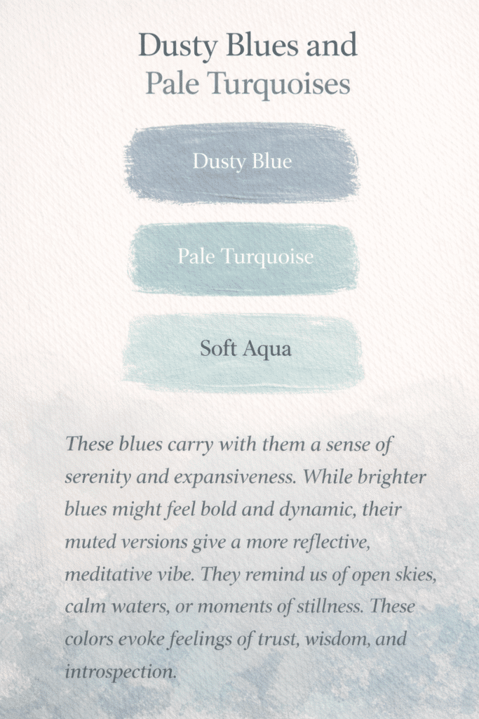
3. Dusty Blues and Pale Turquoises
These blues carry with them a sense of serenity and expansiveness. While brighter blues might feel bold and dynamic, their muted versions give a more reflective, meditative vibe. They remind us of open skies, calm waters, or moments of stillness. These colors evoke feelings of trust, wisdom, and introspection.
How to use intuitively: When our work feels like it needs space or air, dusty blues can offer that sense of openness. They are perfect for creating peaceful compositions or adding a reflective element. If you’re in a phase of deep thought or introspection, these colors can help translate those feelings onto the canvas.
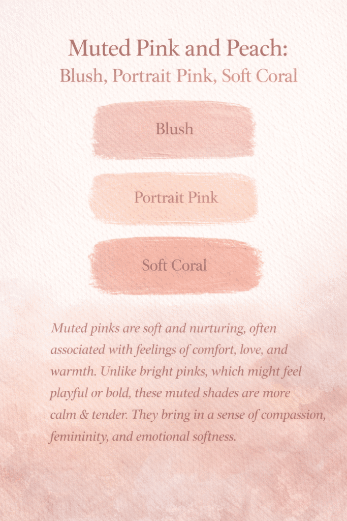
4. Muted Pink and Peach: Blush, Portrait Pink, Soft Coral
Muted pinks are soft and nurturing, often associated with feelings of comfort, love, and warmth. Unlike bright pinks, which might feel playful or bold, these muted shades are more calm & tender. They bring in a sense of compassion, femininity, and emotional softness.
How to use intuitively: These colors are perfect when we want to introduce a gentle, nurturing energy into our painting. If the piece feels like it’s calling for something tender, blush and peach tones can help create that feeling. They balance the heavier, moodier colors and bring in a lightness that’s still emotionally deep.
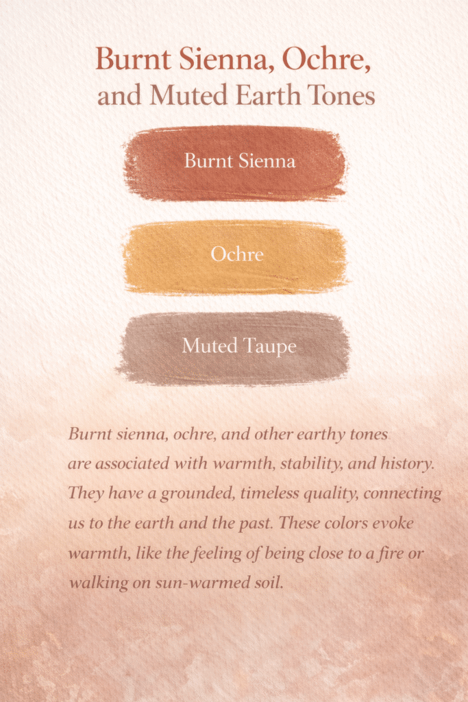
5. Burnt Sienna, Ochre, and Muted Earth Tones
Burnt sienna, ochre, and other earthy tones are associated with warmth, stability, and history. They have a grounded, timeless quality, connecting us to the earth and the past. These colors evoke warmth, like the feeling of being close to a fire or walking on sun-warmed soil.
How to use intuitively: When we want to create a painting that feels rooted in tradition, warmth, or history, these colors are perfect. They’re especially powerful in autumn-themed works or when we’re exploring themes of change, memory, or passage of time. Trust these tones to bring a sense of age and wisdom to your abstract pieces.
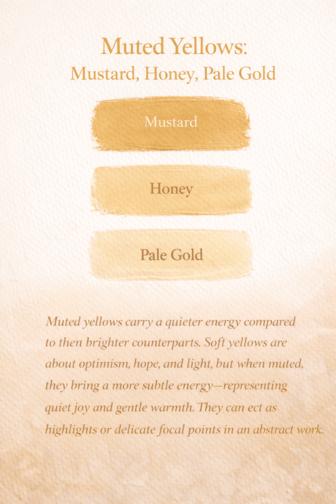
6. Muted Yellows: Mustard, Honey, Pale Gold
Muted yellows carry a quieter energy compared to their brighter counterparts. Soft yellows are about optimism, hope, and light, but when muted, they bring a more subtle energy—representing quiet joy and gentle warmth. They can act as highlights or delicate focal points in an abstract work.
How to use intuitively: These yellows are wonderful for bringing in a subtle glow. They don’t demand attention like a bright yellow, but they add a soft touch of optimism. When your painting feels a little too dark or heavy, adding in some mustard or pale gold can gently lift the mood without breaking the flow of the piece
Tapping Into Intuition Through Color
Now that we’ve explored the meanings behind these colors, how do we use them intuitively? The key is to listen to our emotional state when approaching a painting. Here are some ways we can connect more deeply with color during the creative process:
Let the colors choose us: Before starting a painting, let’s take a moment to observe how certain colors make us feel. Sometimes, the colors that resonate most with us in that moment are the ones we need to use. Trusting this instinct helps us paint more authentically.
Create mood palettes: If we’re working on a specific mood or theme, we can create a palette that reflects those emotions. For example, if we want to evoke nostalgia, a palette of soft beige, blush, and burnt sienna might feel right. If we’re aiming for serenity, muted blues and sage greens could be our guide.
Experiment and reflect: After each painting, let’s take a step back and reflect on how the colors influenced the mood of the piece. Did the dusty blues make us feel calm? Did the muted pinks bring in a sense of softness? This reflection helps us fine-tune our color intuition for future works.
Feel before thinking: Let’s remember that color doesn’t always need to make logical sense. If we’re drawn to an unexpected combination, it’s worth exploring. Colors speak to us in ways that often transcend reason. In abstract painting, that’s where magic happens.
By getting to know our muted, aesthetic colors and tapping into their emotional language, we can create paintings that resonate deeply with both us and those who view them. Let’s trust our intuition to guide us through this beautiful process.