A Joyfully Messy Technique for Textured Backgrounds
What if you could turn an old credit card into your most versatile painting tool? No brushes, no rules—just swipe, blend, and scratch your way to stunning handmade papers.
In this blog, I’ll show you a favorite mixed media technique I keep coming back to—painting credit card papers. It’s fast, freeing, and full of beautiful surprises.
🖼️ What Is a Credit Card Paper?
A credit card paper isn’t anything fancy. It’s just a plain sheet of paper—printer paper, recycled book pages, scrap paper—that’s painted using the edge of an old credit card or plastic card instead of a brush.
Think of it as finger painting with a little more control.
These papers end up looking marbled, distressed, layered, and completely unique—perfect as backgrounds for art journals or collage work.
✨ Why Use a Credit Card?
Because it:
Spreads paint in unpredictable, organic ways
Creates instant texture and marks
Lets you scratch, blend, and smear with ease
Encourages spontaneity and play
And most of all, it helps you let go of perfection.
🎥 Watch the Flip Through on YouTube
In the video, I walk you through each sheet—so you can see the colors, layers, and textures up close. Some are bold, some are subtle, and many have those magical imperfections that only happen when you let go and play.
Whether you’re looking for background inspiration or just want a peek into the process, I hope the video gives you lots of ideas to try in your own studio.
🌈 Technique 1: Color Play with Acrylics + Credit Cards
This is the simplest and most addictive version. All you need are:
A plastic card (like an old credit/debit card)
Acrylic paints (light, dark, pastel, bold—anything!)
Gesso (to create softness and opacity)
Plain paper (printer paper, recycled sheets, or A3 if you want to go big!)
Here are 3 ways to experiment within this technique:
1. Color Play & Marbling
Choose 2–3 colors and start blending them with your credit card. Try adding gesso to lighten darker tones or combine pastel bottles with bold acrylics.
💡 Example: Raw umber and pastel blue created the most unexpectedly beautiful color blend for me—earthy and ethereal.
The way you drag the card—soft swipes, bold strokes, or corner scrapes—creates your unique marbled texture. The more you play, the more surprises show up.
2. Layered Blending
Start with two colors, blend them… then halfway through, drop in a third color and keep blending. You’ll get areas of contrast and transition that add depth to the page.
Each movement of your card matters. Let one color dominate, or keep it balanced—it changes everything.
3. Print Pulling (Ghost Printing)
Once you’ve made one paper and there’s still paint on it, place a blank sheet over it. Press gently, then peel.
You’ll get a soft, highlighted print—often lighter, with peek-through texture. Then add new paint layers to that second sheet for even more variation.
💡 Try pulling a print from a dark paper and layering light pastels or gesso on top—it creates dreamy weathered effects.
Mixed Media Artist Resource Library
Free printables, collage papers, creative prompts & how-to guides
I’ve put together a free resource library designed just for you, packed with everything you need to fuel your creativity. It’s my way of giving back to the mixed media community with resources to inspire your next project. Click here to join.
☕ Technique 2: Spray, Coffee & Flow
This one’s more intuitive and layered, combining paint, homemade spray colors, and coffee stain effects. It’s not just about texture—it’s about mood, movement, and energy.
Here’s a loose formula you can follow:
🪄 Step-by-Step Flow
1. Start with a light background.
Use gesso mixed with acrylics or pastel acrylics. Spread it using your credit card just like in Technique 1.
2. Spray your colors.
Bring in your spray bottles (I love using DIY spray paints made from acrylic + coffee). Spray a little or a lot—choose 2–3 colors that go well together.
3. Add a pop of contrast.
Introduce a complementary or contrasting color into the mix. A small amount can completely transform the composition. It adds spark and helps certain areas stand out amidst the soft blending.
💡 For example: If you’re working with greens and ochres, try a hint of magenta. If you’ve got cool blues, add a touch of burnt orange or sienna.
4. Blend with coffee spray.
Instead of water, spray a light mist of coffee solution. This unifies the sprayed and contrasting colors, letting them melt and merge in unexpected ways.
5. Tilt, drip, flow.
Now for the magic—tilt the paper to let the colors and coffee drip and pool. These natural flows and water trails create breathtaking textures.
6. Swipe with the card.
Use the credit card to move, scratch, or manipulate the colors—adding motion, balance, or roughness.
🔥 Why I Love Technique 2
It’s immersive: I love working on A3 paper so I can use my whole arm, letting my full body energy guide the page.
It’s unpredictable: No two papers look the same, even with the same color palette.
It’s expressive: Adding complementary colors at just the right moment adds drama and interest. A pop of contrast breaks the monotony and invites the eye to dance across the page.
It’s soulful: The drips and stains remind me of tea-soaked pages, aged walls, and rain-kissed windows.
This is intuitive play at its best—quietly chaotic, beautifully unplanned.
🌿 Why This Method Feels So Free
One of my favorite things about painting credit card papers is that it’s completely low pressure.
You’re just playing with paper.
Some pages turn out magical. Some are just okay. Some can be torn up or thrown away.
But you’ll always walk away with:
A handful of gorgeous backgrounds for your art journal
Painted papers ready for collage
A few happy surprises you want to keep just as they are
No overthinking. No perfect outcome. Just color, motion, and feeling.
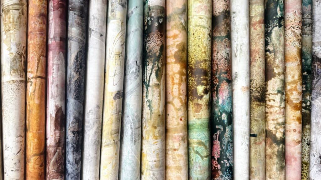
These Papers Make Stunning Art Journal Pages
One of the best things about painting credit card papers is that they don’t just stay as background material—they can become art journal pages on their own.
The textures, layers, and color blends already give them a rich, finished look. So instead of gluing them into your journal, you can actually use them as the journal pages themselves.
I love flipping one over and painting the back side with Coffee + acrylic washes.
This way, each paper becomes a double-sided art journal spread—ready for writing, layering, drawing, or stitching.
You can:
Fold them into handmade journals
Bind them with rings or threads
Use them as standalone inserts
It’s such a satisfying feeling to flip through pages where every side tells a different story.
💡 Tip: Use larger paper (like A3) and fold them in half after painting both sides—it instantly becomes a journal signature!
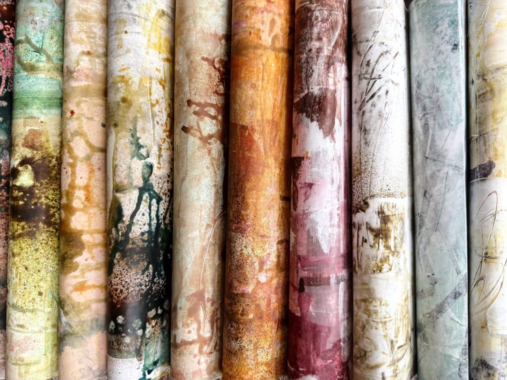
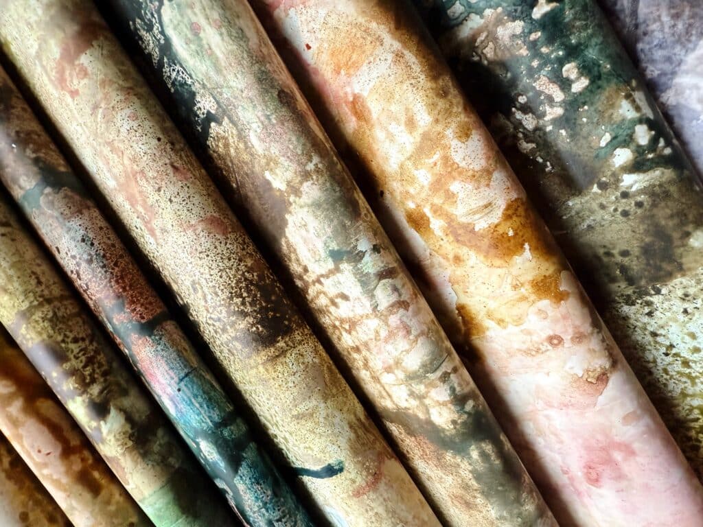
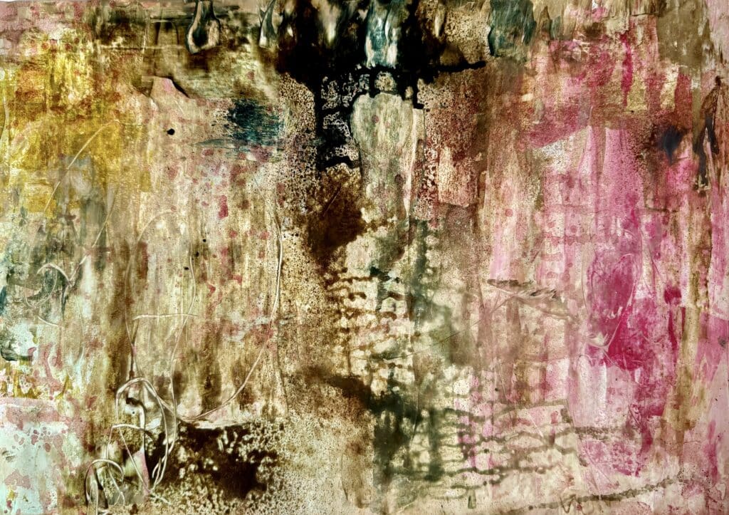
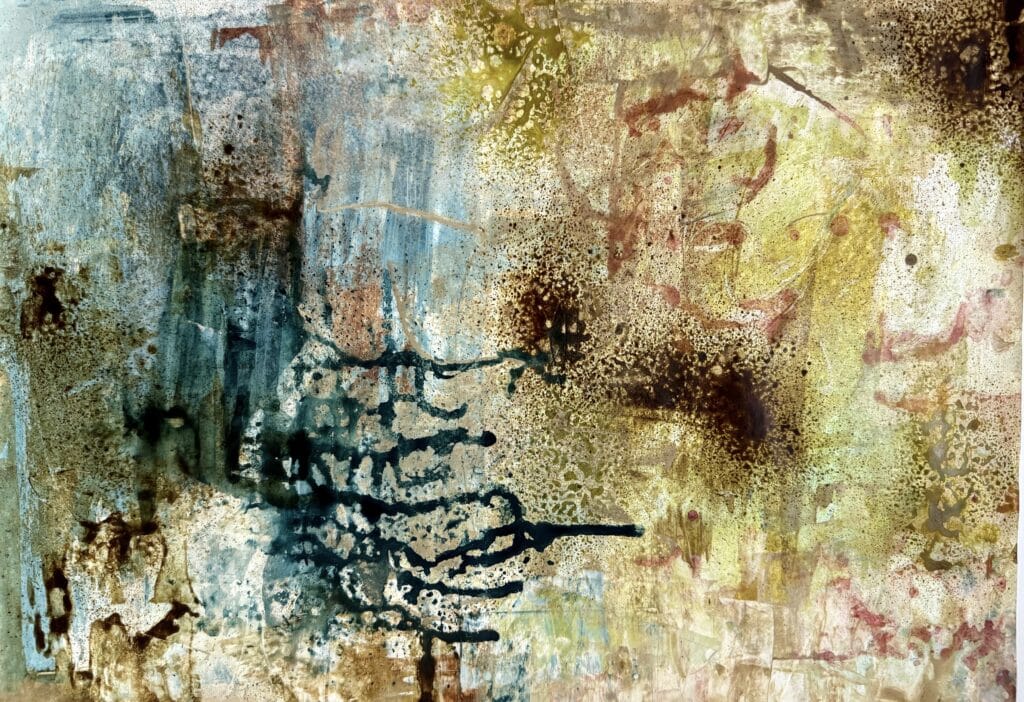
🖼️ Examples from My Studio
Here are two of my credit card papers:
🖼️ First paper: Rich with deep browns, pinks, scratched layers, and coffee textures—perfect for moody collage work or layering with botanical elements.
🖼️ Second paper: Lush greens and ochres with coffee bloom textures and marbled blends—soft and wild all at once.
💡 More Things You Can Try
Try working over old book pages or used copy paper—the underlying text adds visual depth.
Cut your credit card into different shapes (rounded edge, jagged edge) to get new textures.
Add mark making on top using pencils, charcoal, or Posca pens after the paint is dry.
Use stencils or stamps to layer more pattern into the background.
Finish off with a thin glaze of coffee or tea to “age” your papers.
✍️ Frequently Asked Questions (FAQ)
Q: What kind of paper should I use?
A: Start with whatever you have—printer paper, recycled pages, or leftover sketchbook sheets. For Technique 2, heavier paper like 160–200 gsm works best to handle the sprays and coffee.
Q: Can I do this with kids or beginners?
A: Absolutely! It’s fun, messy, and pressure-free. There are no rules—just movement and color.
Q: What if I don’t like how a page turns out?
A: Tear it, layer on top of it, collage with it—or throw it away. That’s the freedom of it. Nothing is wasted.
Q: Do I need special spray paints?
A: Not at all! You can mix your acrylics with water or coffee in small spray bottles. Add a little flow medium or just shake well before using.
Final Thoughts
These techniques are meant to be joyful, freeing, and full of discovery. You don’t need to know where you’re going—you just need to show up with some paint and curiosity.
And once you start, I promise—you’ll end up with a whole stash of beautifully painted papers, each one telling its own quiet story.