Color theory is the backbone of visual arts, influencing the way we perceive and interpret the world around us. Understanding the principles of color and how they interact can significantly enhance your artistic journey.
Whether you’re an experienced artist or a beginner, engaging in fun color theory exercises can unlock new creative avenues and elevate your work to new heights.
In this comprehensive guide, we will explore a variety of exciting color theory exercises that will help you deepen your understanding of color relationships, experiment with harmonies, and discover unique ways to use colors in your artistic compositions.

1. Color Wheel Exploration
1. Creating Your Own Color Wheel
The color wheel is a fundamental tool in color theory. To start your color theory journey, create your own color wheel.
- Begin with the primary colors: red, blue, and yellow.
- Place them equidistant from each other on a circle or wheel.
- These three primary colors form the foundation for all other colors.
- Next, mix equal parts of adjacent primary colors to create the secondary colors: orange, green, and purple.
- Place them between the primary colors on the wheel.
- Finally, mix a primary color with a neighboring secondary color to create tertiary colors, which sit between the secondary colors on the wheel.
2. Mixing Colors: Exploring Color Combinations
Now that you have your color wheel, it’s time to experiment with color combinations. Take two colors that are close to each other on the wheel, such as blue and green. Mix them together to create a new color, known as an intermediate color.
Observe the result and notice how the hue changes. Repeat this process with different combinations of colors to explore a wide range of hues. This exercise will help you understand how colors interact and blend to form new shades.
3. Identifying Color Schemes: Complementary, Analogous, and Triadic
Understanding different color schemes is essential in creating visually appealing compositions. The color wheel serves as a valuable tool for identifying these schemes.
- Complementary colors are those directly across from each other on the wheel, such as red and green or blue and orange. They create a vibrant contrast when used together.
- Analogous colors are found next to each other on the wheel, like yellow, yellow-green, and green. They create a harmonious and cohesive effect.
- Triadic colors form a triangle on the wheel, such as red, blue, and yellow. They offer a balanced and dynamic combination.
Practice identifying and experimenting with these color schemes to gain a deeper understanding of their visual impact.

2. Color Mixing Challenges
1. Primary Colors and Color Mixing
Begin by familiarizing yourself with the primary colors: red, blue, and yellow. Challenge yourself to create secondary colors by mixing equal parts of two primary colors. For example, mixing red and blue will produce purple. Experiment with different ratios and observe how they affect the resulting colors.
2. Mixing Secondary and Tertiary Colors
Once you’ve mastered mixing secondary colors, expand your color mixing skills by combining secondary colors to create tertiary colors. For example, mix orange (a secondary color) with green (another secondary color) to create various shades of brown.
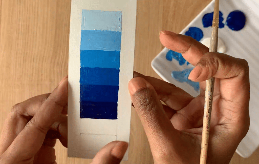
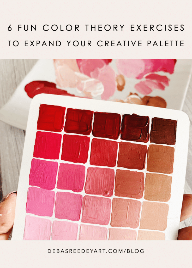
3. Recording Color Mixtures and Ratios
Keep a record of your color mixtures and the ratios you used to achieve specific shades. This will serve as a valuable reference for future artwork and help you develop a sense of color harmony and consistency.
4. Experimenting with Complex Shades
Take your color mixing challenges a step further by attempting to create complex shades and hues. Mix multiple colors together, adjusting the ratios until you achieve the desired result. Explore the vast possibilities that arise from combining different colors and ratios.
This exercise will sharpen your color-mixing skills and expand your understanding of how different pigments interact.
3. Color Harmony Collage
1. Collecting Color Inspirations
Begin by collecting images from magazines, printouts, or online sources that feature color combinations that catch your eye. Look for a variety of colors and compositions that inspire you. Pay attention to how the colors work together and evoke certain moods or emotions.
2. Arranging Shapes and Colors
Once you have gathered your color inspirations, cut out various shapes from the images. These can be simple geometric forms or organic shapes. Arrange them on a poster board or canvas, keeping in mind the principles of color harmony and composition. Play with different placements and overlaps to create an engaging visual arrangement.
3. Exploring Different Color Schemes
As you arrange the shapes, consider incorporating different color schemes into your collage.
- Experiment with monochromatic schemes, using varying shades and tints of a single color.
- Try analogous color schemes, combining colors that are adjacent on the color wheel.
- Explore complementary or split complementary schemes by juxtaposing contrasting colors.
Allow your intuition and personal preferences to guide your choices.
4. Observing Harmony and Balance in the Collage
Step back and observe your color harmony collage as a whole. Notice how the colors interact and create a sense of balance or tension. Pay attention to the emotions or atmospheres evoked by different color combinations. This exercise will enhance your ability to create cohesive and visually pleasing compositions by using colors strategically.
4. Color Swatch Scavenger Hunt
Turn your surroundings into a colorful adventure!
1. Creating a Color Swatch List
Start by creating a list of specific colors or color combinations that you want to find during your color swatch scavenger hunt. You can include colors that you find intriguing or want to explore further. For example, you might list “vibrant red,” “soothing blue-green,” or “warm golden-yellow.”
2. Exploring Your Environment
Take a walk outdoors or explore your surroundings, keeping your color swatch list in mind. Observe the colors present in nature, architecture, signage, or everyday objects. Look for colors that match or closely resemble the ones on your list. Take note of the variety of shades and tones that you encounter.
3. Capturing Colors: Photography or Collecting Samples
There are two ways to capture the colors you find during your scavenger hunt. You can either use a camera to take photographs of the colors you discover, ensuring you capture their exact hues. Alternatively, you can collect small samples of materials or objects that represent the colors on your list. This could include leaves, fabric swatches, or small paint chips.
4. Showcasing Your Color Collection
Arrange the photographs or collected samples together to create a visually captivating color collection. You can organize them on a poster board or create a digital collage. Observe the range of colors you found and reflect on the impact they have when seen side by side. This exercise encourages you to develop an appreciation for the colors in your environment and trains your eye to notice subtle variations and harmonies.
5. Color Contrast Experiment
1. Understanding Color Contrast
Color contrast refers to the differences in hue, value (lightness or darkness), and saturation between colors. It plays a crucial role in creating visual interest and emphasis in artwork. Understanding the various types of color contrast, such as complementary (opposite colors on the wheel), simultaneous (colors affecting each other when placed side by side), and light-dark contrast, allows you to make intentional choices in your compositions.
2. Choosing High-Contrast Color Pairs
Select two colors with a high contrast to experiment with in your artwork. For example, you can choose black and white, yellow and purple, or blue and orange. Consider the emotional impact and visual intensity these color pairs can create.
3. Creating Artworks with Emphasis on Contrast
The interplay between light and dark, warm and cool colors can dramatically impact the mood and focus of your artwork.
Use the high-contrast color pair to create a simple artwork or composition. Explore different techniques and mediums such as painting, drawing, or digital art. Pay attention to how the colors interact and how the contrast enhances certain elements or focal points in your piece. Experiment with different arrangements, proportions, and color placements to achieve the desired impact.
4. Analyzing the Impact of Contrast in Your Work
Step back and evaluate the effects of color contrast in your artwork. Observe how the contrasting colors create a sense of depth, movement, or drama. Consider how the contrast influences the mood, energy, or focus of the piece. This exercise helps you develop a keen eye for effective color contrast and empowers you to use it purposefully to convey specific messages or evoke particular emotions.
This exercise will train your eye to recognize and utilize color contrast effectively.

6. Color Symbolism Exercise
1. Cultural and Psychological Associations of Colors
Colors hold symbolic meanings that vary across cultures and contexts. Research the cultural and psychological associations of colors to understand the different emotions, ideas, and concepts they can evoke. For instance, red can represent passion, love, or anger, while blue may symbolize calmness, trust, or sadness.
2. Exploring Symbolic Meanings
Select a range of colors and delve into their symbolic meanings. Reflect on personal experiences and cultural influences that shape your perception of each color. Consider how these symbolic associations can be applied in your artwork to communicate or evoke specific themes or messages.
3. Creating Artworks with Symbolic Intent
Use the symbolic meanings of colors as inspiration to create a series of small artworks or illustrations. Incorporate the chosen colors and explore how they contribute to the narrative or emotional depth of your pieces. Experiment with different styles, techniques, and visual elements to enhance the intended symbolism.
4. Conveying Emotions and Concepts through Color
Reflect on the emotional and conceptual impact of your color choices in the symbolic artworks you’ve created. Analyze how the colors contribute to the overall mood, atmosphere, or story. Consider how variations in color intensity, saturation, or value can enhance or alter the desired emotional response.
This exercise encourages you to explore the psychological impact of colors and adds depth to your artistic storytelling.
Pin the below image in your Pinterest board for future reference.
Color theory exercises are not only educational but also immensely enjoyable. They offer a hands-on approach to understanding color relationships and their application in various art forms. By participating in these exercises, you can expand your creative palette, improve your color-mixing skills, and develop a keen eye for color harmony and contrast.
Embrace the joy of experimentation and let color theory be your guide as you embark on a journey of self-expression through art.
So, grab your brushes, pencils, or digital tools, and immerse yourself in the captivating world of color.
Through these fun color theory exercises, you will unlock your full artistic potential and create stunning visual compositions that resonate with viewers and leave a lasting impact.
Now it’s your turn! Have you tried any of these color theory exercises? What was your favorite? How has exploring color relationships influenced your artwork? Share your experiences and insights in the comments below. Let’s inspire and learn from each other as we dive deeper into the vibrant world of colors.