Color is a captivating aspect of our visual world. It influences our emotions, perceptions, and the way we interpret the world around us. In the realm of art and aesthetics, color theory plays a crucial role in creating harmonious compositions.
To delve into the depths of color theory, it is essential to first understand the fundamental question: What is color? In this article, we will explore the nature of color and its underlying principles.
1. The Nature of Color
Color, at its core, is a subjective and perceptual experience that arises from the interaction between light and our visual system. It is the way our brain interprets different wavelengths of light as distinct hues.
Visible light, which is a small portion of the entire electromagnetic spectrum, ranges from shorter wavelengths (blue and violet) to longer wavelengths (red).
When light encounters an object, certain wavelengths are absorbed by the object, while others are reflected or transmitted.
It is the reflected or transmitted light that enters our eyes and triggers the sensation of color.
2. Color Perception and the Human Eye
Before getting into color theory, it’s essential to understand how our eyes perceive color. The human eye perceives color through specialized cells called cones, located in the retina. Cones are sensitive to different wavelengths of light, primarily responsible for our trichromatic color vision.
There are three types of cones:
- those sensitive to short wavelengths (blue)
- medium wavelengths (green)
- long wavelengths (red).
These cones work in tandem to allow us to perceive a wide range of colors.
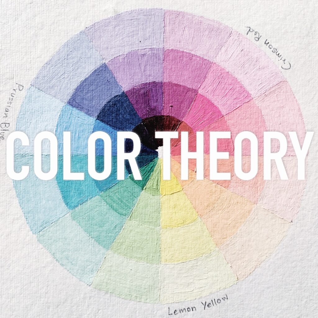
3. Isaac Newton's discovery of color & color wheel

This journal page is my notes taken from the online class: COLOR THEORY MASTERCLASS
Isaac Newton’s exploration of color and his discovery of the color wheel were groundbreaking contributions to the field of optics and our understanding of light and color.
The renown mathematician Sir Isaac Newton invented the first color wheel around 1671-72. While studying white light reflecting off prisms, he noticed that the light reflected a spectrum of 7 colors. He observed the way light would separate and appear to bend as it passed through a prism. That’s is how he figured that the origin of color is light.
All he did is shone a beam of light through an angular prism and split it into 7 spectrums – the 7 colors of the rainbow – red, orange, yellow, green, blue, indigo and violet.
The entire color spectrum encompasses a range of light comprising diverse wavelengths, with each wavelength being reflected at a distinct angle. Thus, each color or spectrum is separated, producing a rainbow of 7 colors.
- Red, with its longer wavelength, tends to occupy the outermost portion of a rainbow’s arch, while violet, with its shorter wavelength, typically appears on the inner side of the arch.
- Interestingly, at the edges of a rainbow, the colors blend and overlap, creating a seamless transition between the different hues.
Through Newton’s experiments, it was also discovered that red, yellow, and blue are the primary colors, serving as the foundation from which all other colors can be derived. This ground-breaking revelation astonished both artists and scientists, as it established light as the fundamental source of all color. All he did is join the 2 ends of the spectrum with red and violet, and formed the color wheel.
Newton’s experiments and his creation of the color wheel laid the foundation for our understanding of color, inspiring further investigations and developments in the field of color theory. His contributions continue to influence our knowledge and appreciation of color to this day.
4. Color Properties
Colors possess various properties that contribute to their appearance and interaction. These properties include:
- Hue: Hue refers to the pure color itself, such as red, blue, or yellow. It is determined by the dominant wavelength of light.
- Saturation: Saturation represents the intensity or purity of a color. A highly saturated color appears vivid and vibrant, while a desaturated color appears muted or grayish.
- Lightness or Value: Lightness or value refers to the relative brightness or darkness of a color. It is determined by the amount of light reflected by an object.
This Color Theory Masterclass will help you learn and implement these concepts better in your art practice!
5. Color Harmonies and Relationships
Color theory explores the relationships and harmonies between colors. Concepts such as complementary colors, analogous colors, and color temperature (warm vs. cool) aid in creating visually appealing and balanced compositions.
Conclusion
Color is a fascinating and dynamic element that enriches our visual experiences and influences our emotions. Understanding the nature of color, its perception, and the principles of color theory empowers us to create impactful and harmonious compositions.
As artists, designers, and enthusiasts, we have the privilege of harnessing the power of color to evoke emotions, communicate messages, and express our unique perspectives.
So, how will you use your newfound knowledge of color theory to enhance your creative endeavors and engage with your audience on a deeper level?
Pin the below image in your Pinterest board for future reference.