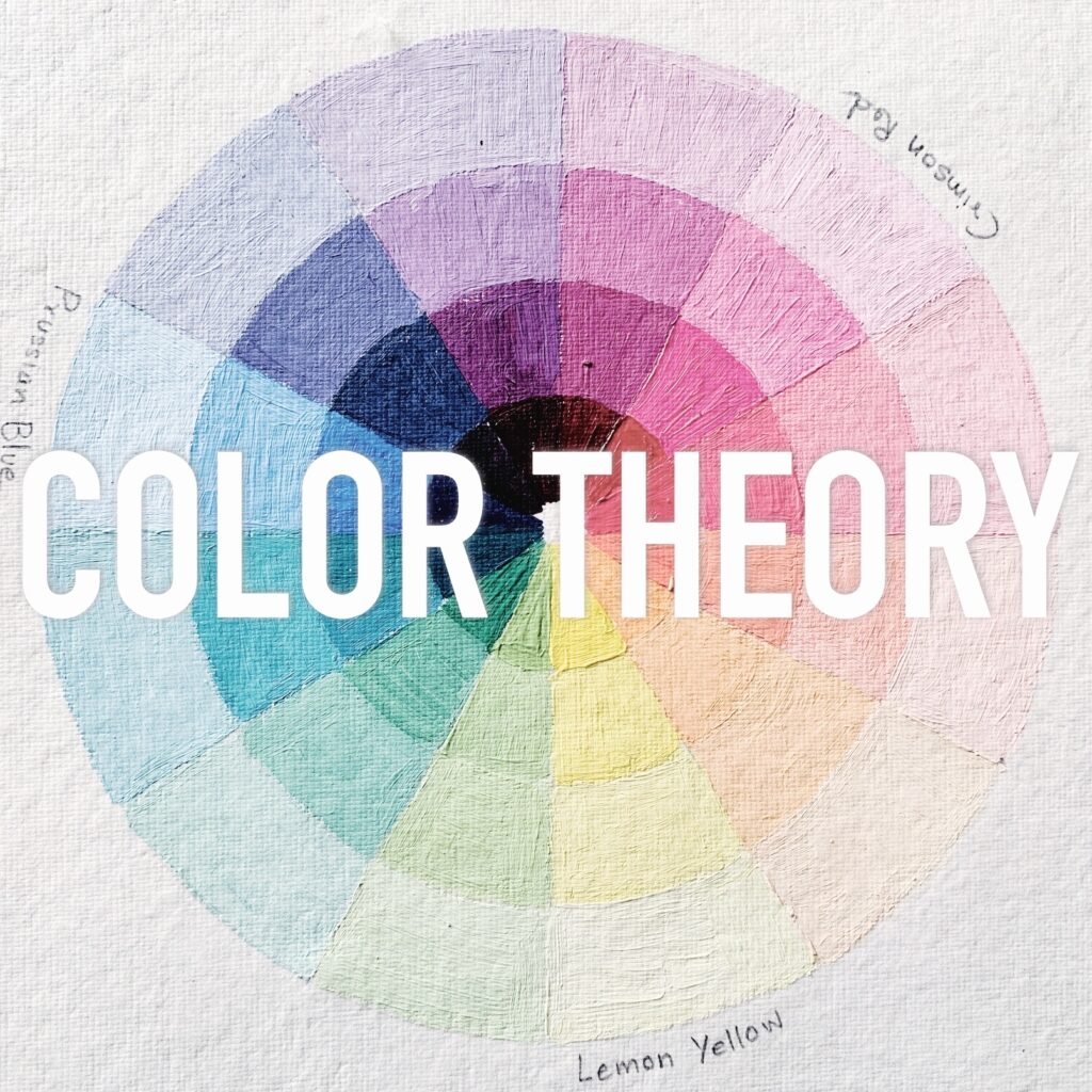
Color theory is a fundamental aspect of art. It helps artists understand the properties of color, their relationships, and how to effectively use them in their artwork.
While learning about color theory is essential, practical exercises and tips can greatly enhance your understanding and application of this knowledge.
In this article, we will explore a variety of hands-on practical exercises to enhance your understanding of color theory. These exercises will help you experiment with different color combinations, explore color interactions, develop your color perception skills, and gain confidence in your color choices.
By actively engaging in these exercises and following the tips provided at the end, you will deepen your understanding of color theory and its application in your artwork.
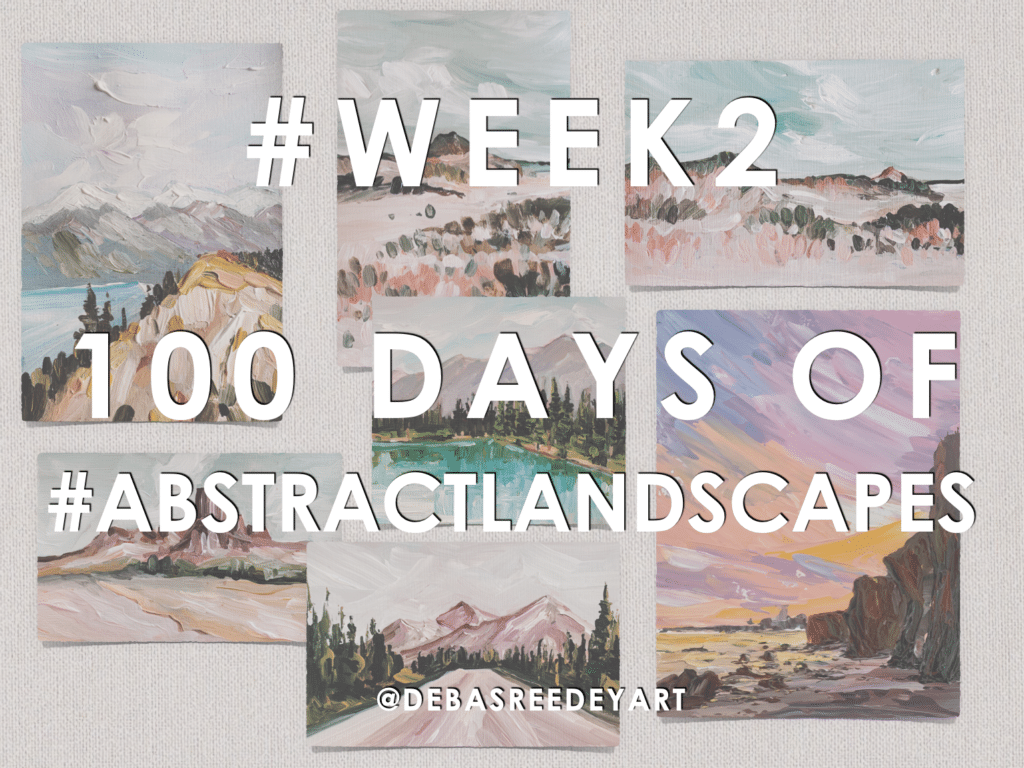
This Color Theory Masterclass will help you learn and implement these concepts better in your art practice!
1. Color Mixing Exercises
Color mixing is a crucial skill for artists. It allows you to create a wide range of hues, shades, and tones.
Start by familiarizing yourself with the primary colors: red, blue, and yellow.
Experiment with mixing these primary colors to create secondary and tertiary colors.
Take note of the proportions and observe how they affect the resulting color.
Additionally, try mixing complementary colors to understand how they interact and create contrast.
Through these color mixing exercises, you will develop an intuitive understanding of color relationships and expand your color palette.
2. Value Studies
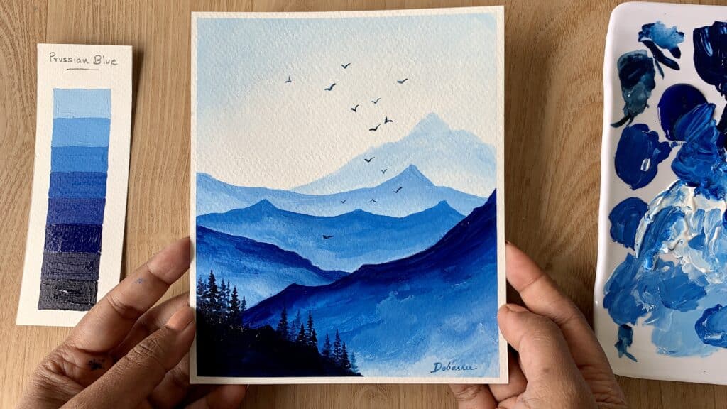
Understanding the value scale is essential for creating depth and contrast in your artwork.
Choose a single color and create a value scale by mixing it with varying amounts of white or black.
Start with the pure color and gradually add white to create tints, representing lighter values.
Then, mix the pure color with black to create shades, representing darker values.
Arrange these values from light to dark to observe the visual hierarchy they create.
Practicing value studies will train your eye to perceive and effectively use values in your artwork.
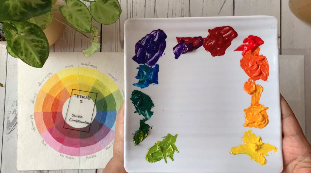
3. Color Harmony Exploration
Color harmony refers to the pleasing arrangement of colors in an artwork. One way to explore color harmony is by creating small color studies using specific color schemes.
Experiment with complementary colors by selecting colors that are opposite each other on the color wheel.
Alternatively, explore analogous colors by choosing colors that are adjacent to each other on the color wheel. Triadic color schemes can also be exciting to explore, where you select three colors that are evenly spaced on the color wheel.
Observe how these color combinations interact and how they create different moods and visual impacts.
Through this exploration, you will develop a sense of color harmony and gain confidence in selecting harmonious color palettes for your artwork.
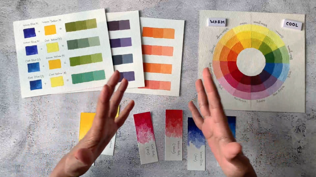
4. Color Temperature Studies
Color temperature refers to the perceived warmth or coolness of a color.
Warm colors, such as red, orange, and yellow, create a sense of energy and vibrancy.
Cool colors, such as blue, green, and purple, evoke a sense of calmness and serenity.
To better understand color temperature, create small studies using warm or cool color schemes.
Experiment with different combinations of warm or cool colors and observe how they interact.
Note how warm colors appear to advance in a composition, while cool colors tend to recede.
Understanding color temperature will allow you to create depth, atmosphere, and focal points in your artwork.

5. Observation of Color in the Environment
Developing a keen eye for color requires observing colors in your surroundings.
Take the time to appreciate the colors in nature, everyday objects, and scenes around you.
Analyze the color combinations and observe how lighting conditions affect color perception.
Pay attention to how colors interact with each other and how they can convey different emotions or atmospheres.
This practice will train your eye to see subtle color nuances and inspire you to incorporate interesting color combinations in your artwork.

6. Experimentation and Play
To truly master color theory, it’s important to experiment and play with color. Allow yourself to be spontaneous and explore unconventional color combinations.
Step out of your comfort zone and try unexpected color choices. Push the boundaries of saturation and value to create unique effects in your artwork.
Remember, art is a journey of exploration, and embracing experimentation will help you discover your own artistic style and push the boundaries of color theory.
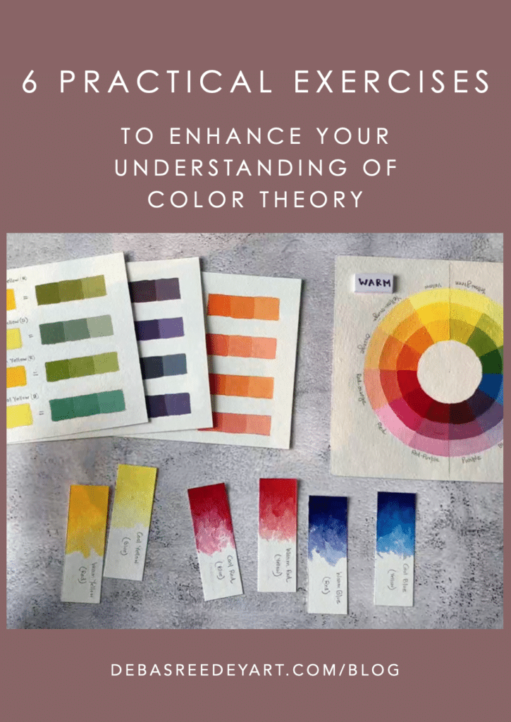
Pin the below image in your Pinterest board for future reference.
Color theory is a fascinating realm that unlocks the power of color in our artistic pursuits.
By engaging in practical exercises and implementing helpful tips, we can deepen our understanding of color relationships, expand our creative possibilities, and create captivating compositions that resonate with viewers.
Now, it’s time to put your knowledge into action!
- Have you tried any of these color theory exercises?
- How did they enhance your understanding of color and improve your artwork?
- Are there any specific color theory concepts or techniques you would like to explore further?
Share your experiences and thoughts in the comments below. Let’s continue to learn and grow together as we harness the enchanting world of color in our artistic endeavors.