Whether you’re a budding artist or just someone who appreciates the beauty of colors, understanding the color wheel is essential. It’s like having a secret decoder ring for creating captivating artwork.
In this comprehensive guide, we’ll dive into the fascinating world of colors, exploring their relationships, meanings, and practical applications. So grab your brushes and let’s paint our way through the rainbow!
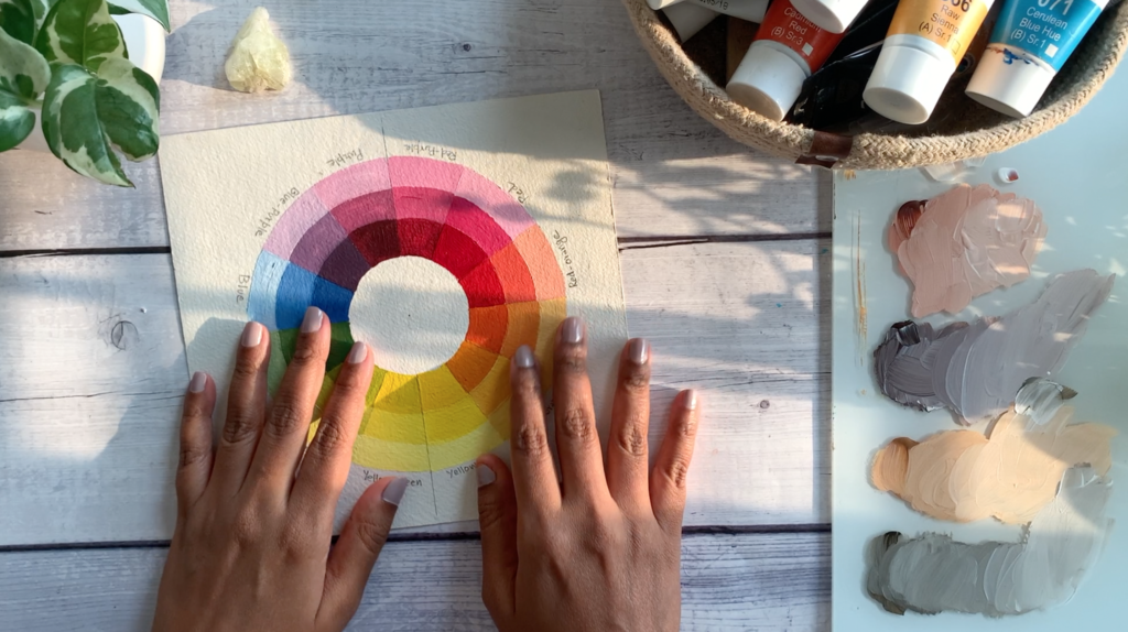
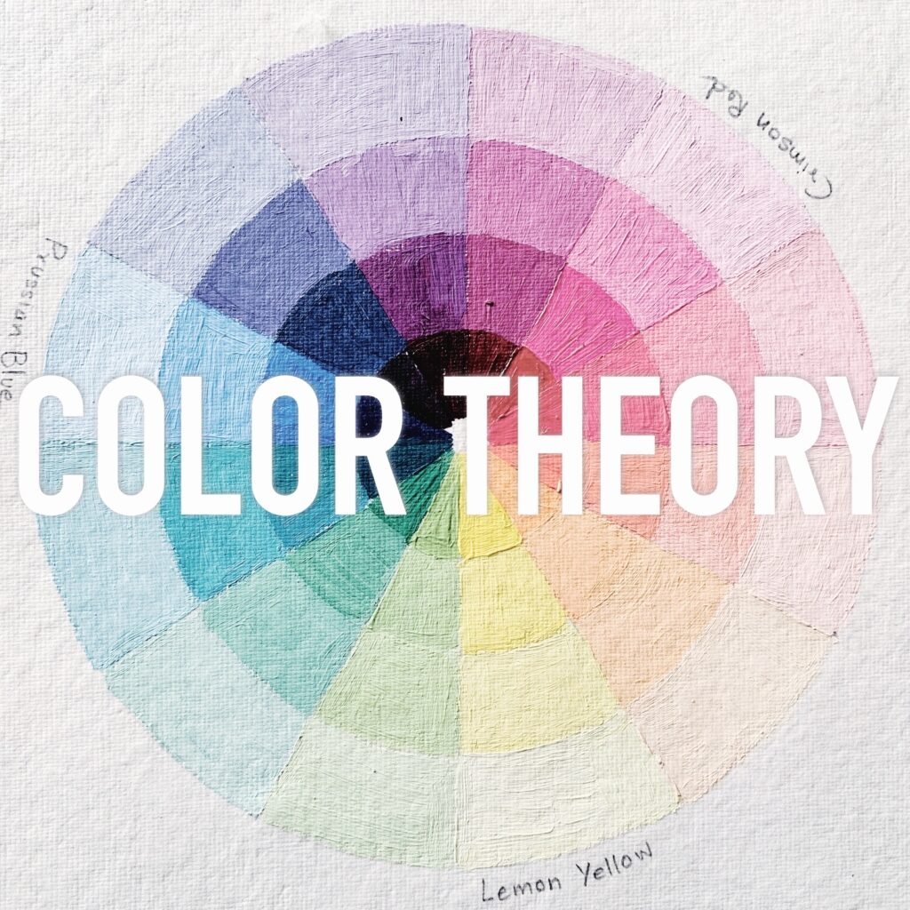
1. What is a Color Wheel?
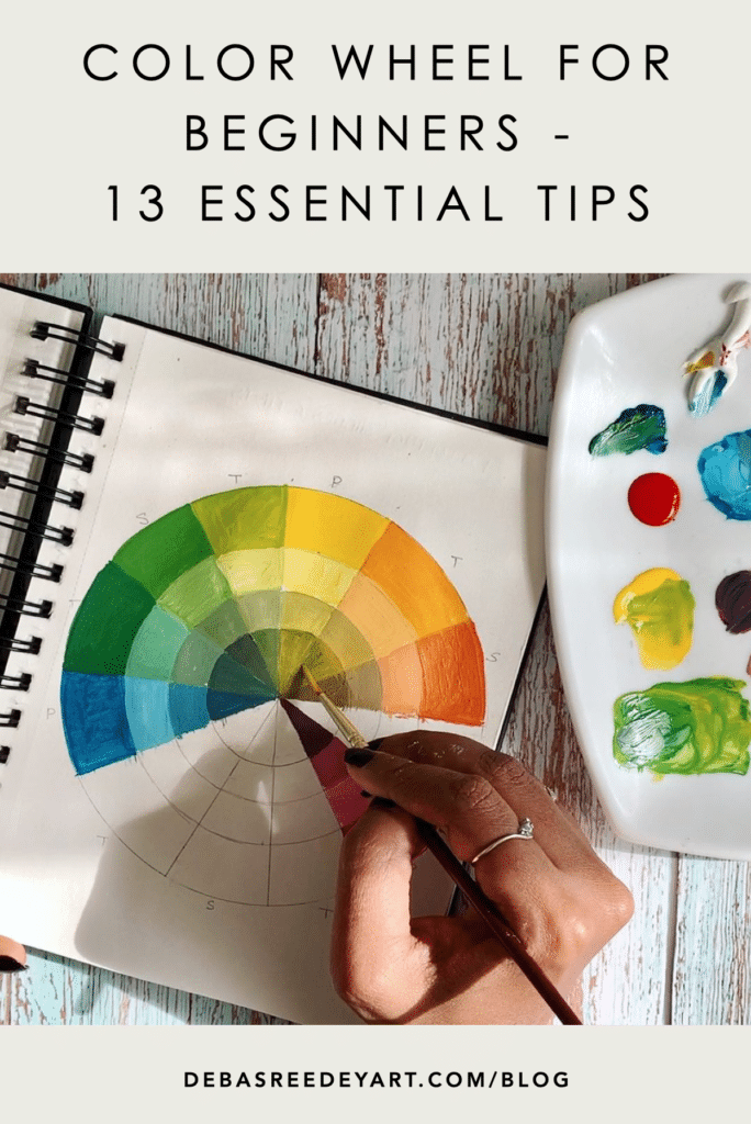
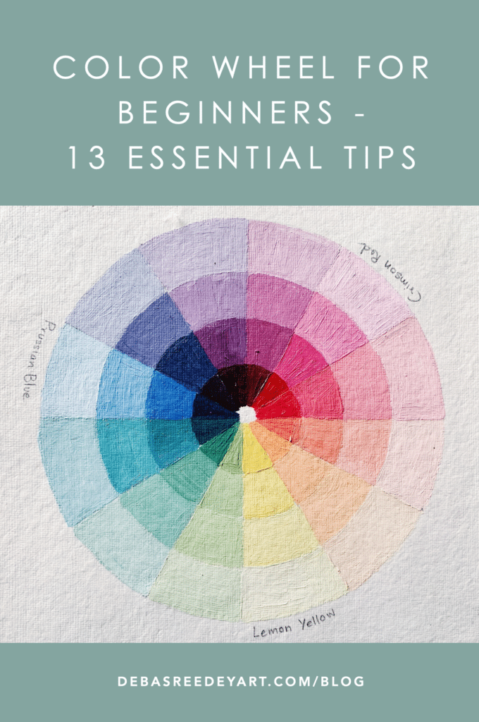
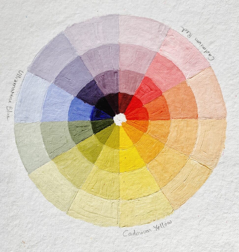
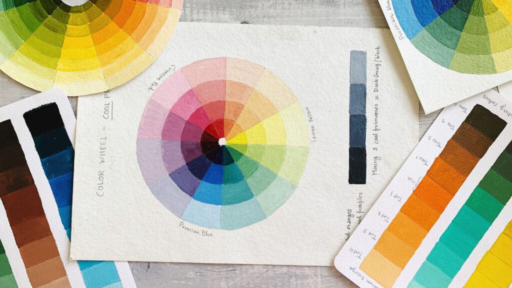
The color wheel is a circular arrangement of colors, showcasing their harmonious connections. It’s like a delicious pizza with different slices representing various hues.
The primary colors—red, blue, and yellow—sit at equal distances from each other, forming the foundation. From there, secondary colors (green, orange, and purple) emerge by mixing adjacent primaries. Tertiary colors bridge the gap between primary and secondary hues.
2. Primary Colors: The Building Blocks
Primary colors are the building blocks of all other colors. These are red, blue, and yellow. Think of them as the foundation of your color palette.
- Red: Passionate, fiery, and attention-grabbing.
- Blue: Calm, serene, and introspective.
- Yellow: Sunny, optimistic, and full of energy.
Why Primary Colors Matter
Lorem ipsum dolor sit amet, consectetur adipiscing elit. Ut elit tellus, luctus nec ullamcorper mattis, pulvinar dapibus leo.
3. Secondary Colors: Mixing Magic
Secondary colors are created by mixing two primary colors – mixing red and yellow makes orange, blue and yellow make green, and red and blue make purple.
- Green: The color of nature, growth, and balance.
- Orange: Warm, vibrant, and associated with enthusiasm.
- Purple: Regal, mysterious, and often linked to creativity.
Creating Secondary Colors
Experimenting with primary colors to create secondary ones is a great way to get a feel for color mixing. It’s like baking a cake; you need to get the right ingredients and proportions to get the perfect mix. You can experiment by changing the proportions of the primary colors to come up with a range of secondary colors.
4. Tertiary Colors: The In-Betweens
Tertiary colors are made by mixing a primary color with a secondary color. Examples include red-orange, yellow-green, and blue-violet.
- Red-Orange: Like a ripe tomato.
- Yellow-Green: Fresh grass on a dewy morning.
- Blue-Purple: Twilight skies.
Why Tertiary Colors Are Important
These colors add depth and complexity to your artwork. They are the subtle shades that can bring your paintings to life.
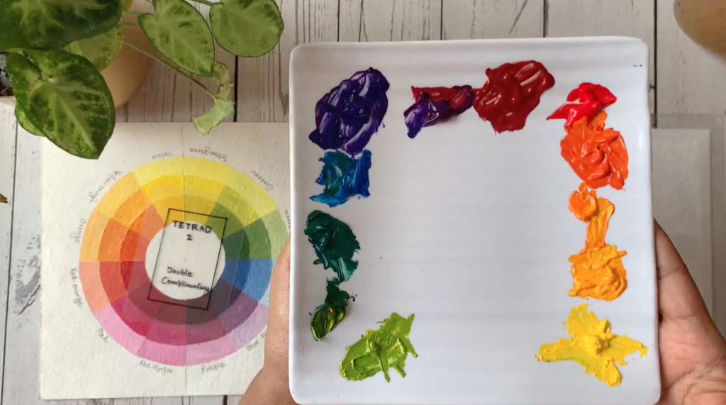
5. Color Harmony: Making Colors Work Together
Color harmony refers to the pleasing arrangement of colors. It’s what makes certain color combinations look good together.
Types of Color Harmony
- Complementary Colors: Colors opposite each other on the wheel. They create high contrast and vibrant looks.
- Analogous Colors: Colors next to each other on the wheel. They blend well and create serene and comfortable designs.
- Triadic Colors: Three colors evenly spaced on the wheel. They offer vibrant and balanced combinations.
Understand each of the color schemes in more detail in my online class – Color Theory for beginners. Click here to visit.
6. Complementary Colors: Opposites Attract
Complementary colors are directly opposite each other on the color wheel, such as red and green or blue and orange.
Using Complementary Colors
These colors create a strong contrast, making elements stand out. It’s like the dynamic between yin and yang, creating a balance of opposites.
- Red and Green: Christmas vibes!
- Blue and Orange: Ocean meets sunset.
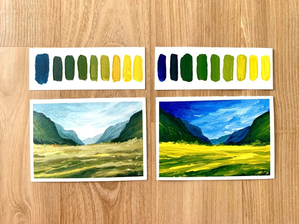
7. Analogous Colors: Best Friends Forever
Analogous colors are neighbors on the wheel. They share a similar undertone and create harmonious compositions. Imagine
Benefits of Analogous Colors
They are naturally harmonious and pleasing to the eye. Using them is like creating a smooth gradient in your art.
- Yellow, Yellow-Green, and Green: A sunny meadow.
8. Triadic Colors: The Perfect Trio
Triadic colors are three colors evenly spaced around the color wheel. Think of red, yellow, and blue.
How to Use Triadic Colors
These combinations are vibrant and balanced, perfect for creating lively and dynamic artwork.
- Red, Yellow, and Blue: Primary perfection!
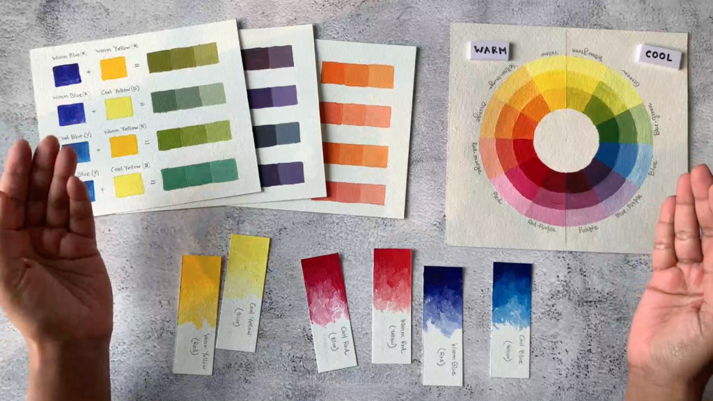
9. Warm and Cool Colors: The Temperature of Hues
Warm Colors Explained
Warm colors include reds, oranges, and yellows. They evoke feelings of warmth and energy, like a sunny day.
- Reds, oranges, and yellows evoke coziness and energy.
Cool Colors Explained
Cool colors include blues, greens, and purples. They create a calm and soothing effect, like a peaceful ocean.
- Blues, greens, and purples bring calmness and serenity.
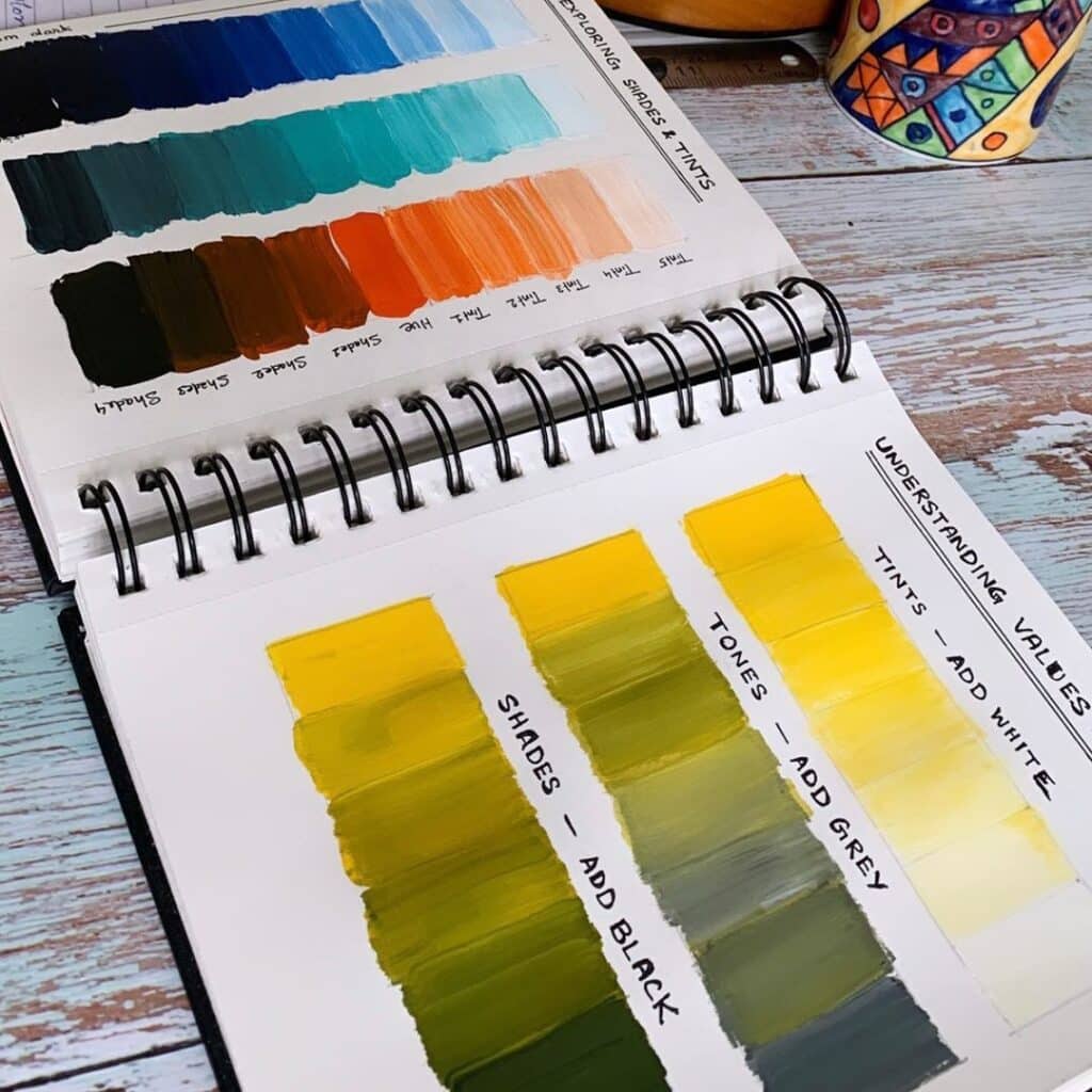
10. Neutral Colors: The Unsung Heroes
Warm Colors Explained
Neutrals include black, white, gray, and sometimes brown. They don’t appear on the color wheel but are crucial in art.
why Neutrals are so important
Neutrals can balance out more vibrant colors and create a sense of sophistication and simplicity in your artwork.
Neutral colors—such as grays, browns, and beige—provide balance and allow other colors to shine. They’re like the supporting actors in a vibrant play.
11. Color Psychology: The Mood of Colors
Colors can influence emotions and perceptions. For instance, red can evoke excitement, while blue can be calming.
Applying Color Psychology
Using the right colors can set the mood for your artwork, whether you want it to be energetic, peaceful, or somber.
12. Color Mixing Tips for Beginners
Start with Small Amounts
When mixing colors, start with small amounts to avoid wasting paint. It’s like adding salt to a dish—better to add a little and adjust.
Keep a Color Journal
Document your color mixing experiments in a journal. It’s a helpful reference and can inspire future projects.
13. Practical Exercises to Master the Color Wheel
Create a Color Wheel
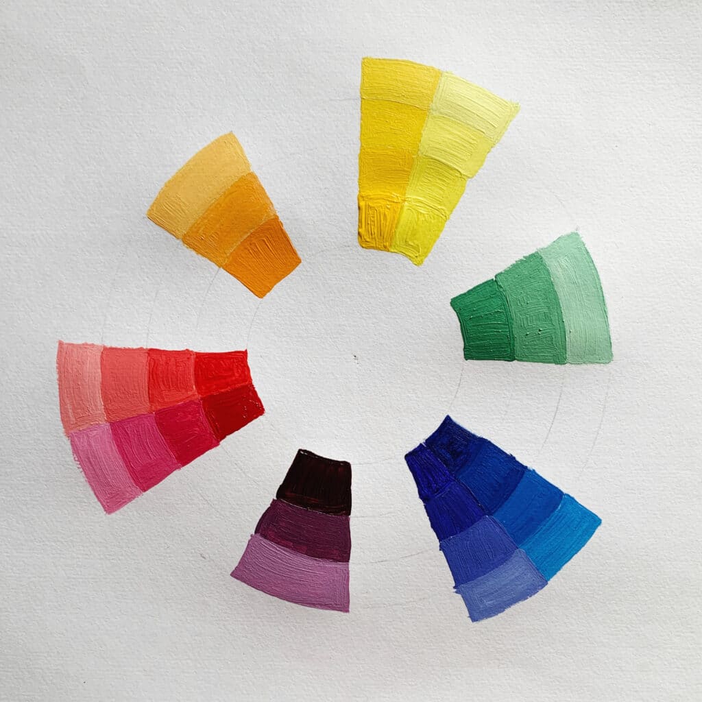
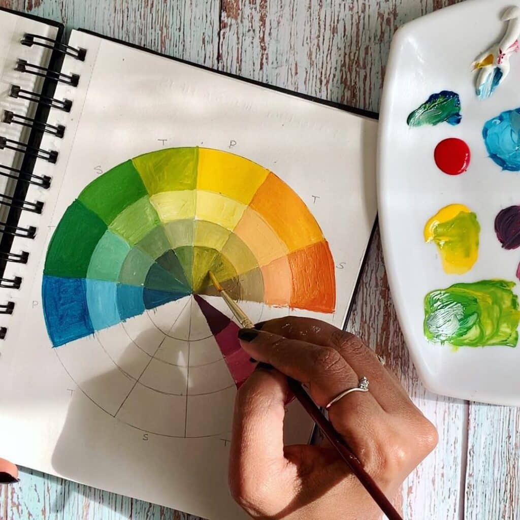
Make your own color wheel using paints. This hands-on exercise helps reinforce the relationships between colors.
Paint a Color Chart
Create a chart of different color mixes and combinations. It’s a great way to see the range of hues you can create.
Check out: 6 Fun Color Theory Exercises To Expand Your Creative Palette
Conclusion
The color wheel is more than just a circle of colors—it’s a powerful tool that can transform your art. By understanding and mastering it, you can create more dynamic, harmonious, and visually appealing pieces.
Now that you’re armed with color knowledge, go forth and paint! 🎨
But before you dip your brush, tell us: What’s your favorite color, and why? Share your thoughts in the comments below!
If you enjoyed reading this article, visit me in my online class and let us learn together.
FAQs
1. What is the most important aspect of the color wheel for beginners? The most important aspect is understanding the relationships between primary, secondary, and tertiary colors. This foundational knowledge will help you mix and match colors effectively.
2. How can I avoid making muddy colors? To avoid muddy colors, clean your brush thoroughly between colors and be mindful of your color mixing. Start with small amounts and mix gradually.
3. What are complementary colors, and why are they useful? Complementary colors are pairs of colors opposite each other on the color wheel. They are useful because they create a strong contrast and can make elements in your artwork stand out.
4. Can I use the color wheel for digital art? Absolutely! The principles of the color wheel apply to both traditional and digital art. Many digital art programs have built-in color wheels to help you choose harmonious colors.
5. How do I know if my color combinations are harmonious? Using color harmony principles like complementary, analogous, and triadic color schemes can help ensure your color combinations are visually pleasing. Experiment and trust your instincts!
This Color Theory Masterclass will help you learn and implement these concepts better in your art practice!
Pin the below image in your Pinterest board for future reference.